
Do you want to hide a mobile menu in WordPress?
Most WordPress themes come with built-in styles that automatically transform your navigation menus into a mobile menu. However, you may not wish to use the same menu on mobile or may want to use a different menu style.
In this article, we will show you how to easily hide a mobile menu in WordPress using a plugin or code method.
Method 1. Hide a Mobile Menu in WordPress using a Plugin
This method is easier and is recommended for beginners. We’ll use a plugin to hide your existing mobile menu provided by your WordPress theme and then use a different menu or no menu at all on mobile devices.
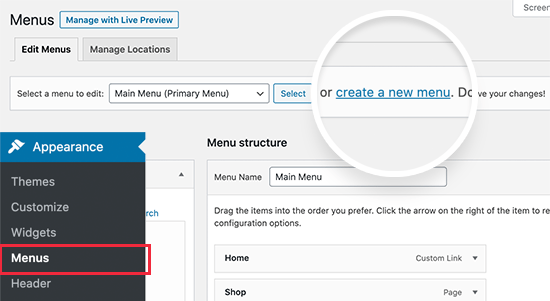
First, you need to visit the Appearance » Menus page and create a new navigation menu that you would like to display on mobile devices.
On the next screen, you need to provide a name for your new menu that helps you identify it later. We’ll call it ‘Mobile Menu’. After that, you can select the items you want to add to your menu from the left column.
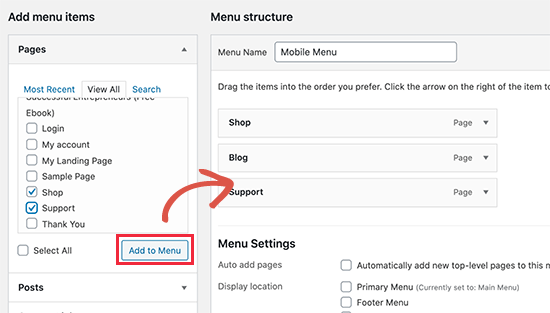
Once you are finished adding items to your menu, don’t forget to click on the Save Menu button to save your menu.
If you need help creating a new navigation menu, then follow our beginner’s guide to creating a navigation menu in WordPress.
Next, you need to install and activate the WP Mobile Menu plugin. For more details, see our step by step guide on how to install a WordPress plugin.
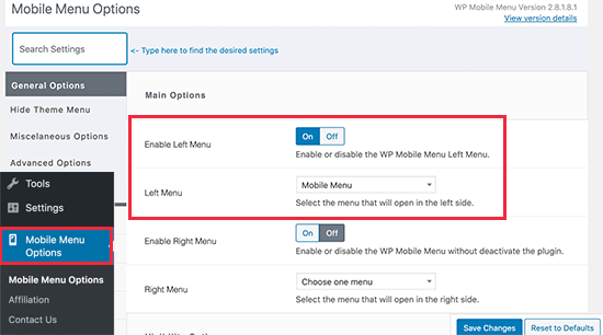
Upon activation, you need to visit Mobile Menu Options page to configure plugin settings. From here, you need to select whether you want to display your mobile menu on the right or to the left by turning the toggle On.
From the drop-down menu, select the mobile menu you created earlier.
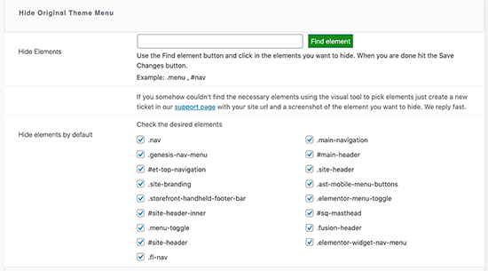
Next, you need to scroll down to the ‘Hide Original Theme Menu’ section. This is where you can tell the plugin to hide a mobile menu created by your WordPress theme.
By default, the plugin will use commonly used element identifiers used by most popular WordPress themes. Most users wouldn’t need to do anything here.
However, if the plugin fails to hide your theme’s menu, then you can come back here and click on the ‘Find Element’ button to simply point to your theme’s navigation menu.
Don’t forget to click on the Save Changes button to store your settings.
Now that we have set up the plugin, we need to tell WordPress site to display our mobile menu to the new menu location added by the plugin.
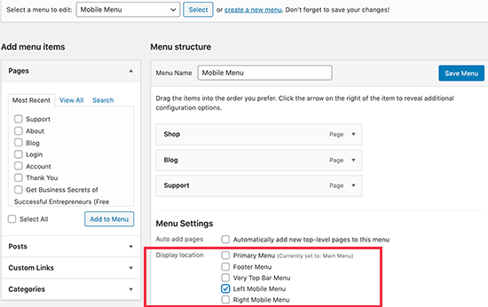
Simply, go to the Appearance » Menus page. Make sure the mobile menu you created earlier is selected in the drop down menu. Below your menu item choose the location you selected in the plugin settings (e.g. Left Mobile Menu or Right Mobile Menu).
You can now visit your website to see your new menu in action. The plugin will now hide your theme’s mobile menu and display a custom menu instead.
WP Mobile Menu plugin allows you to change the color of the menu bar, change opacity, add icons, and more in the settings. Feel free to play around with those settings.
Method 2. Hide Mobile Menu using CSS Code
This method is a bit advanced and requires some custom CSS to be used.
For this method, you can choose to use two different approaches. You can just hide a complete mobile menu using CSS, or you can hide individual menu items on mobile devices.
1. Hiding a complete menu on mobile devices using CSS
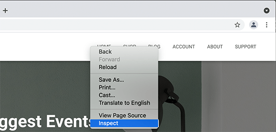
First, you need to figure out the element you need to modify using custom CSS. To do that, simply go to your website and take the mouse over to your navigation menu. After that, right click and select Inspect tool.
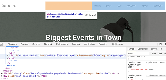
Your browser screen will split into two, and you’ll see the source code of your webpage. Now this navigation menu is not the one you need to target because it is visible on the desktop screen.
You need to rearrange your browser screen by dragging it from the corner to a smaller size until the desktop navigation menu is replaced by the mobile menu.
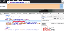
You need to figure out the identifier and CSS class used by your WordPress navigation menu. You can do that by moving your mouse on the source code until the menu area is highlighted.
As you can see in the screenshot above, our test theme is using the navbar-toggle-wrapper class.
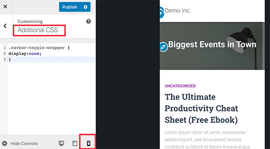
After that, you need to go to Appearance » Customize page in WordPress admin area to launch theme customizer. Here, you need to switch to the ‘Additional CSS’ tab and click on the mobile icon at the bottom right corner of the left panel.
The customizer will now show a preview of how your site will look on mobile devices. You can now enter the following CSS code and see your mobile menu disappear in the preview panel.
.navbar-toggle-wrapper {
display:none;
}
Don’t forget to replace the .navbar-toggle-wrapper with the identifier used by your WordPress theme.
After that, click on the ‘Publish’ button at the top to save your changes.
2. Hiding specific menu items in mobile menu using CSS
This method allows you to create a navigation menu and then selectively show or hide items that you don’t want to display on mobile or desktop devices.
The advantage of this method is that you can use the same navigation menu for mobile and desktop and simply hide the items that you don’t want to be seen.
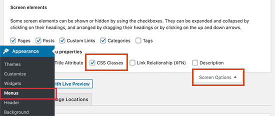
First, you need to go to Appearance » Menus page and click on the Screen Options button at the top right corner of the screen. From here, you need to check the box next to the ‘CSS Classes’ option.
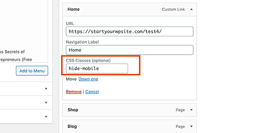
After that. you need to scroll down to a menu item that you want to hide on mobile devices and click to expand it. In the menu item settings, you’ll now see the option to add a CSS class. Go ahead and add .hide-mobile CSS class there.
Repeat the process for all menu items you don’t want to show on mobile.
Similarly, you can also click on the menu items that you want to hide on desktop computers. This time, add the .hide-desktop CSS class instead.
Once you are finished, don’t forget to click on the Save Menu button to store your changes.
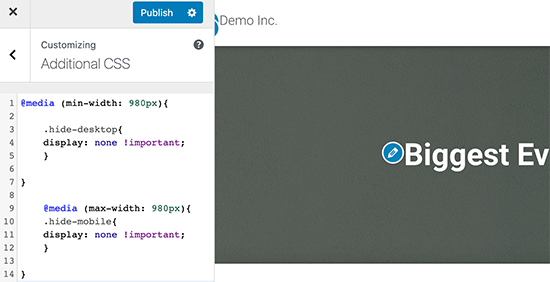
Now we will add custom CSS to hide these menu items. Simply go to the Appearance » Customize page to launch the Theme Customizer and click on the Additional CSS tab.
You need to add the following CSS code in the CSS box.
@media (min-width: 980px){

    .hide-desktop{
    display: none !important;
    }

}

    @media (max-width: 980px){
    .hide-mobile{
    display: none !important;
    }

}
Don’t forget to click on the Publish button to save your changes.
You can now visit your website and you will notice that items that you wanted to hide on desktop are no longer visible in the menu. Adjust your browser screen to a smaller size and you will notice the same for the mobile menu as well.
We hope this article helped you learn how to easily hide a mobile menu in WordPress. You may also want to see our article on how to create custom pages in WordPress or how to create a custom theme from scratch without writing code.
If you liked this article, then please subscribe to our YouTube Channel for WordPress video tutorials. You can also find us on Twitter and Facebook.
The post How to Hide a Mobile Menu in WordPress (Beginner’s Guide) appeared first on WPBeginner.




Subscribe to MarketingSolution.
Receive web development discounts & web design tutorials.
Now! Lets GROW Together!