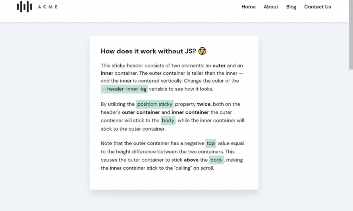
Imagine a header of a website that is nice and thick, with plenty of padding on top and bottom of the content. As you scroll down, it shrinks up on itself, reducing some of that padding, making more screen real estate for other content.
Normally you would have to use some JavaScript to add a shrinking effect like that, but there’s a way to do this using only CSS since the introduction of position: sticky.

Let me just get this out there: I’m generally not a fan of sticky headers. I think they take up too much of the screen’s real estate. Whether or not you should use sticky headers on your own site, however, is a different question. It really depends on your content and whether an ever-present navigation adds value to it. If you do use it, take extra care to avoid inadvertently covering or obscuring content or functionality with the sticky areas — that amounts to data loss.
Either way, here’s how to do it without JavaScript, starting with the markup. Nothing complicated here — a <header> with one descendant <div> which, intern, contains the logo and navigation.
<header class="header-outer">
  <div class="header-inner">
    <div class="header-logo">...</div>
    <nav class="header-navigation">...</nav>
  </div>
</header>
As far as styling, we’ll declare a height for the parent <header> (120px) and set it up as a flexible container that aligns its descendant in the center. Then, we’ll make it sticky.
.header-outer {
  display: flex;
  align-items: center;
  position: sticky;
  height: 120px;
}
The inner container contains all the header elements, such as the logo and the navigation. The inner container is in a way the actual header, while the only function of the parent <header> element is to make the header taller so there’s something to shrink from.
We’ll give that inner container, .header-inner, a height of 70px and make it sticky as well.
.header-inner {
  height: 70px;
  position: sticky;
  top: 0;
}
That top: 0? It’s there to make sure that the container mounts itself at the very top when it becomes sticky.
Now for the trick! For the inner container to actually stick to the “ceiling” of the page we need to give the parent <header> a negative top value equal to the height difference between the two containers, making it stick “above” the viewport. That’s 70px minus 120px, leaving with with — drumroll, please — -50px. Let’s add that.
.header-outer {
  display: flex;
  align-items: center;
  position: sticky;
  top: -50px; /* Equal to the height difference between header-outer and header-inner */
  height: 120px;
}
Let’s bring it all together now. The <header> slides out of frame, while the inner container places itself neatly at the top of the viewport.
We can extend this to other elements! How about a persistent alert?
While it’s pretty awesome we can do this in CSS, it does have limitations. For example, the inner and outer containers use fixed heights. This makes them vulnerable to change, like if the navigation elements wrap because the number of menu items exceeds the amount of space.
Another limitation? The logo can’t shrink. This is perhaps the biggest drawback, since logos are often the biggest culprit of eating up space. Perhaps one day we’ll be able to apply styles based on the stickiness of an element…
The post How to Create a Shrinking Header on Scroll Without JavaScript appeared first on CSS-Tricks.
You can support CSS-Tricks by being an MVP Supporter.


Subscribe to MarketingSolution.
Receive web development discounts & web design tutorials.
Now! Lets GROW Together!